Selected work focused on building scalable identity systems across retail, service, and local business environments.
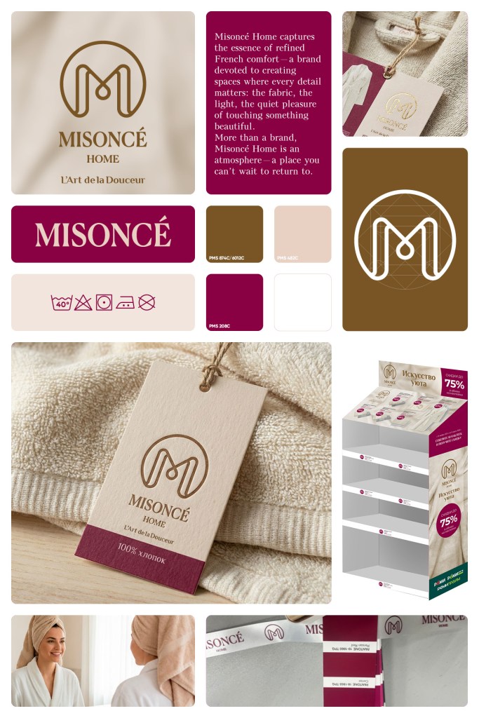
Led full brand system development for a French-inspired bath and towel line (11 SKUs), covering naming, visual identity, and packaging design. The system was integrated into a loyalty-driven retail program across 115+ grocery stores and rolled out end-to-end from concept to shelf in approximately six months.
Resulted in exceeding sales targets, increasing average basket size, and achieving consistent sell-through across all SKUs through improved category visibility and program integration.
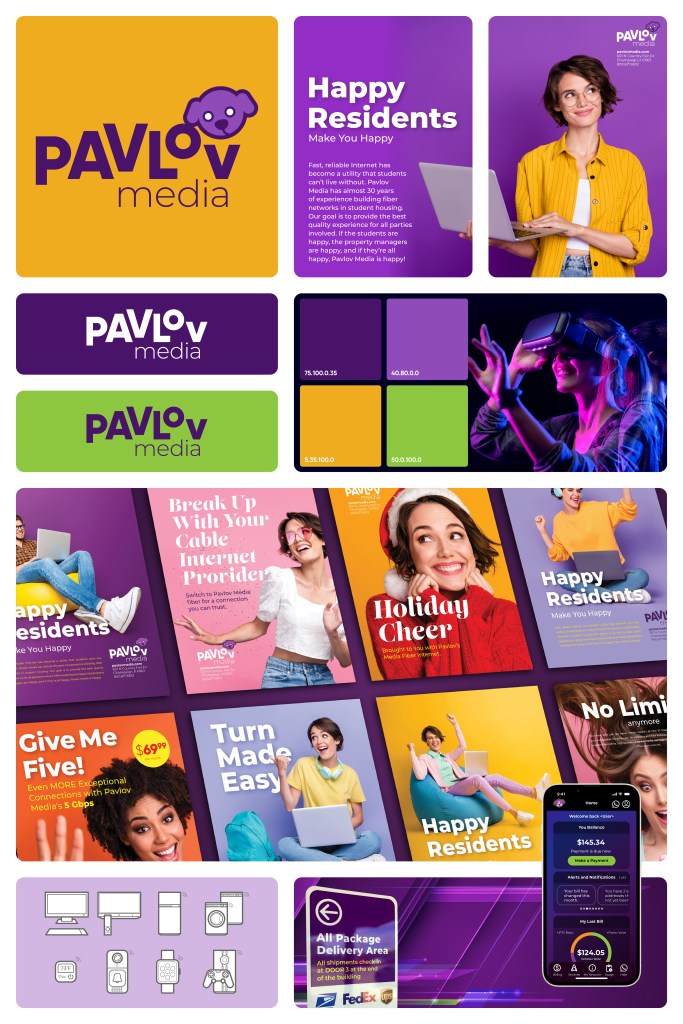
PAVLOV MEDIA: Developed a unified visual system for a fiber internet provider operating in multi-unit residential environments. The challenge was to consolidate fragmented marketing and operational materials into a single scalable communication framework.
The system improved consistency across resident-facing and operational touchpoints, enabling clearer communication and more efficient use of materials by both internal teams and field installers.
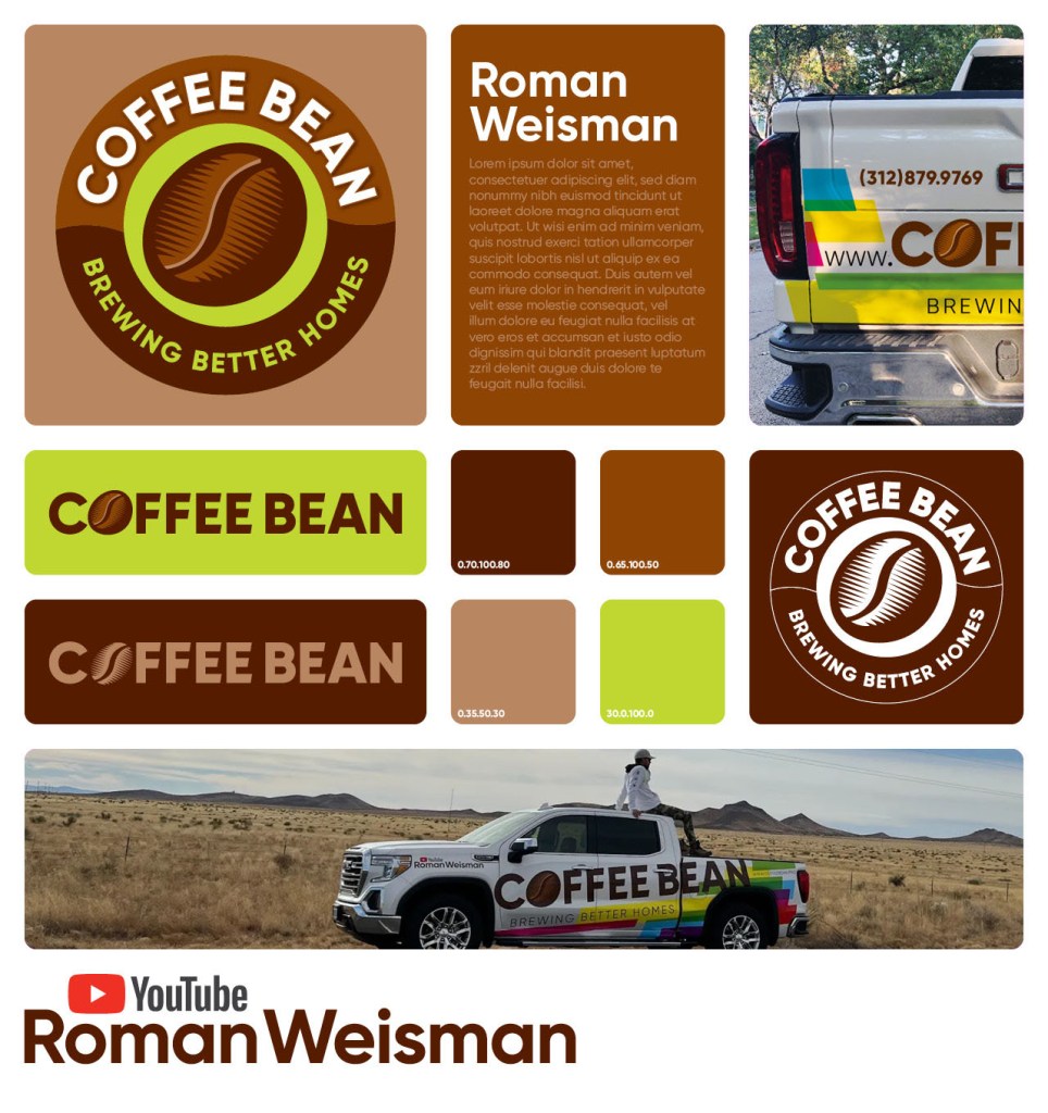
Coffee Bean Developed a distinctive logo identity for a home repair company, designed to stand out in a category dominated by generic contractor branding. Focused on creating strong local recognition through vehicle applications and high-contrast visual presence.
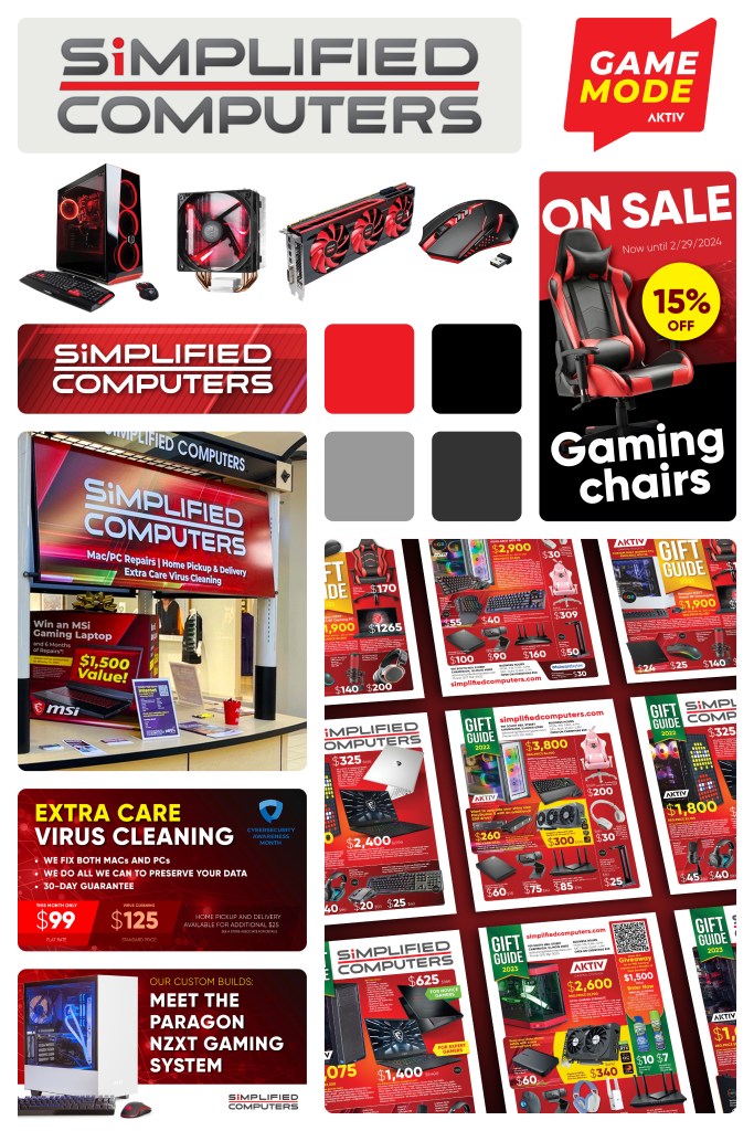
SIMPLIFIED COMPUTERS: Designed a high-visibility brand identity system for a local computer retail and service business in a highly price-driven and promotion-heavy market.
Built a modular, high-contrast system focused on speed, clarity, and retail communication efficiency, using strong typography and a red-led visual hierarchy optimized for rapid content updates.
The system was implemented across storefront signage, promotional campaigns, and in-store materials, supporting ongoing sales activity and improving visual consistency across touchpoints.
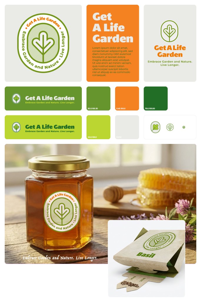
GET A LIFE GARDEN: Developed a lifestyle brand identity for a gardening and natural living concept focused on wellness and everyday simplicity. Created a symbolic identity system centered around a leaf mark and a warm green–orange palette, designed for flexibility across packaging and product expansion. The system balanced organic expression with strong shelf visibility in a competitive retail environment.
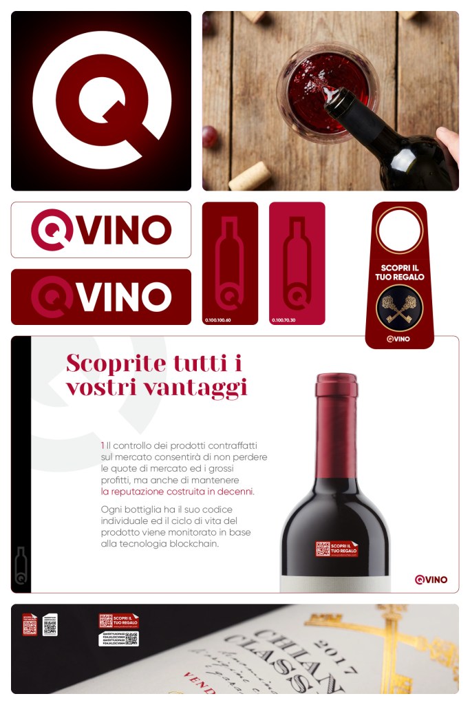
Q-VINO | Italy: Created the core logo identity for Qvino, defining the visual foundation for the brand. Designed a distinctive, scalable mark that established the tone and recognition system later expanded into full brand identity.
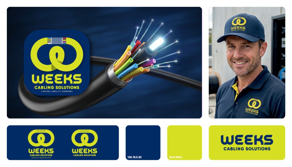
WEEKS CABLING SOLUTIONS: Created a visual identity system for a B2B fiber-optic installation company operating in a technical infrastructure sector. The system was built on principles of network structure and fiber color logic, ensuring clarity, consistency, and usability across field operations, documentation, and client communication materials. Delivered a scalable identity system supporting both operational efficiency and brand trust.
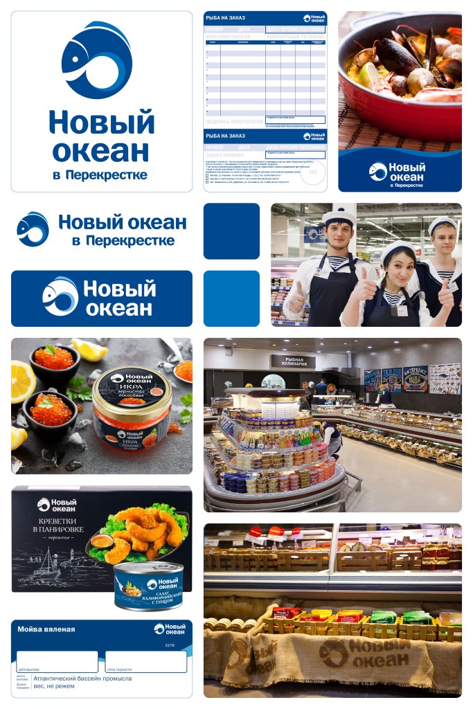
New Ocean | Russia
Led the end-to-end launch of a new seafood retail concept—from naming and identity to full in-store experience. Developed a scalable visual system including brand guidelines, retail design, navigation, POS materials, and staff uniforms.
it was successfully launched four pilot stores, generating strong consumer traction and securing government support. The concept scaled into dedicated seafood departments across the Perekrestok chain (~1,000 stores nationwide) and evolved into a private label brand under the same brand.
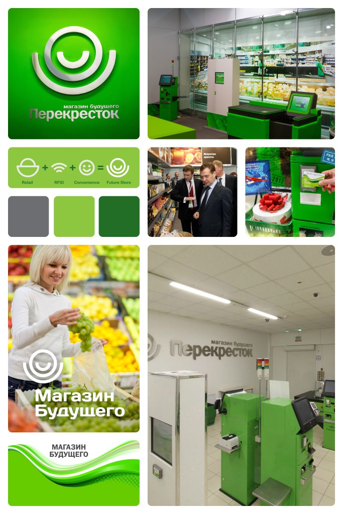
Perekrestok Future Store (ROSNANO) | Russia
A next-generation retail concept developed with ROSNANO and X5 Retail Group — exploring a fully automated, RFID-powered shopping experience with no checkout lines.
Led art direction across the entire customer journey — from brand identity to physical space and digital interfaces. Designed the logo and visual system, exhibition booth for Rusnanotech 2011, pilot store environment, and all UX/UI graphics for self-checkout and scanning systems. Built a cohesive visual language connecting physical retail and invisible technology — enabling intuitive interaction with automated systems and seamless navigation across the space. The project evolved from a concept showcase into a fully operational pilot store, becoming a flagship example of next-gen retail in Russia and gaining strong attention from industry and government stakeholders.
Highlight: The exhibition booth was visited and highly praised by the President of Russia.
Result: Delivered a fully integrated design system for one of the first high-tech retail environments in the market.
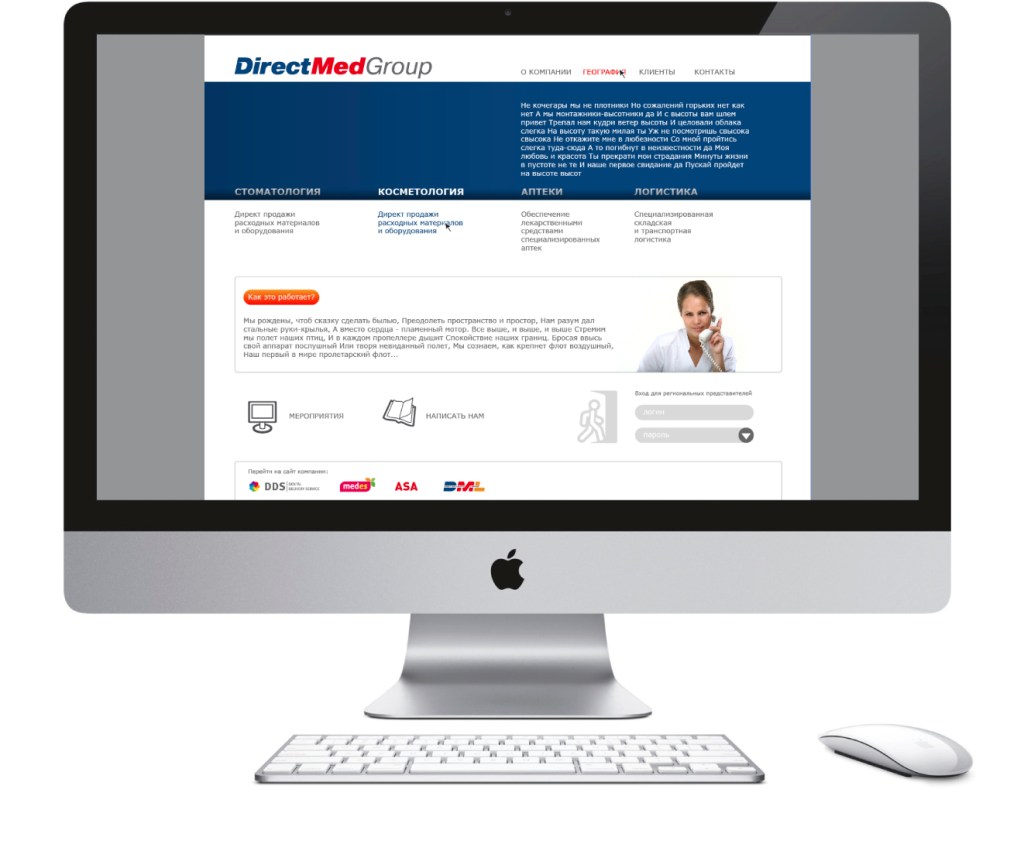
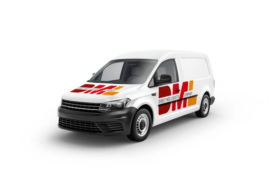
Led the development of a comprehensive brand system for DirectMedGroup and its four subsidiary companies: DDS (dental supplies distribution), MedEs (aesthetic medicine distribution), DML (logistics), and ASA (specialized pharmacy retail chain). Scope included brand identity systems, website design, product catalogs, print advertising campaigns, retail interiors, and a full range of POS/POP/promotional materials across multiple business units.